

You might have noticed that we recently released a new and polished menu. We wanted to give you a little more info on why we built it and how.
What menu? Plum is a chatbot isn't it?
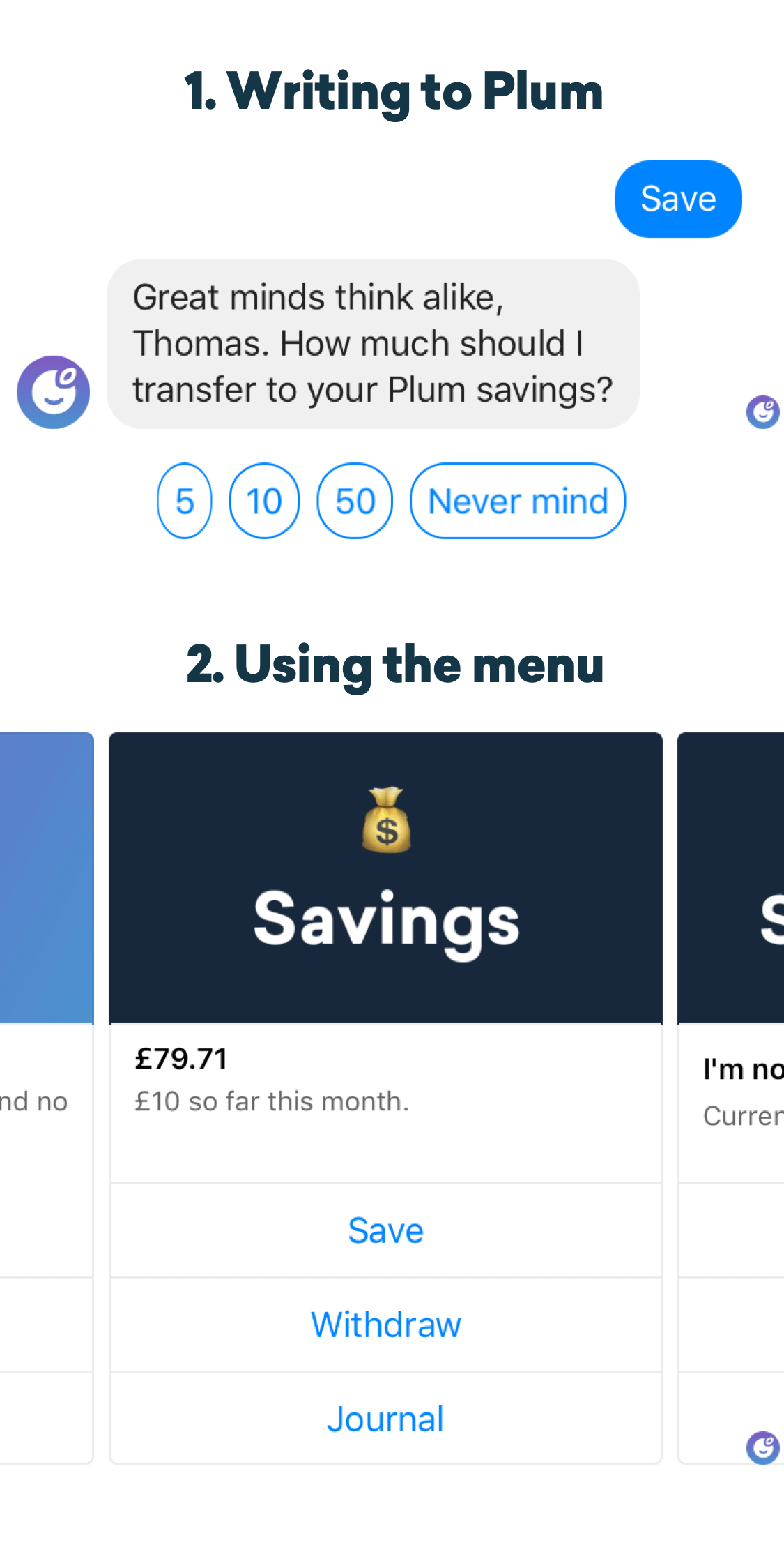
When you use a regular app the menu is usually a set of buttons at the bottom of the screen or accessed via a menu button in the top left/right corner of the app. Since Plum lives in Facebook Messenger there are two ways of using Plum; writing to Plum or using the menu. You can use one of the ways, or both, it’s up to you!
Reasons for updating the menu
Designing a new menu is a scary thing since it’s an essential part of the user experience. It’s not something we take lightly. But as we’re expanding our features to do more for our growing user base, we wanted to give some extra love and attention to the menu.
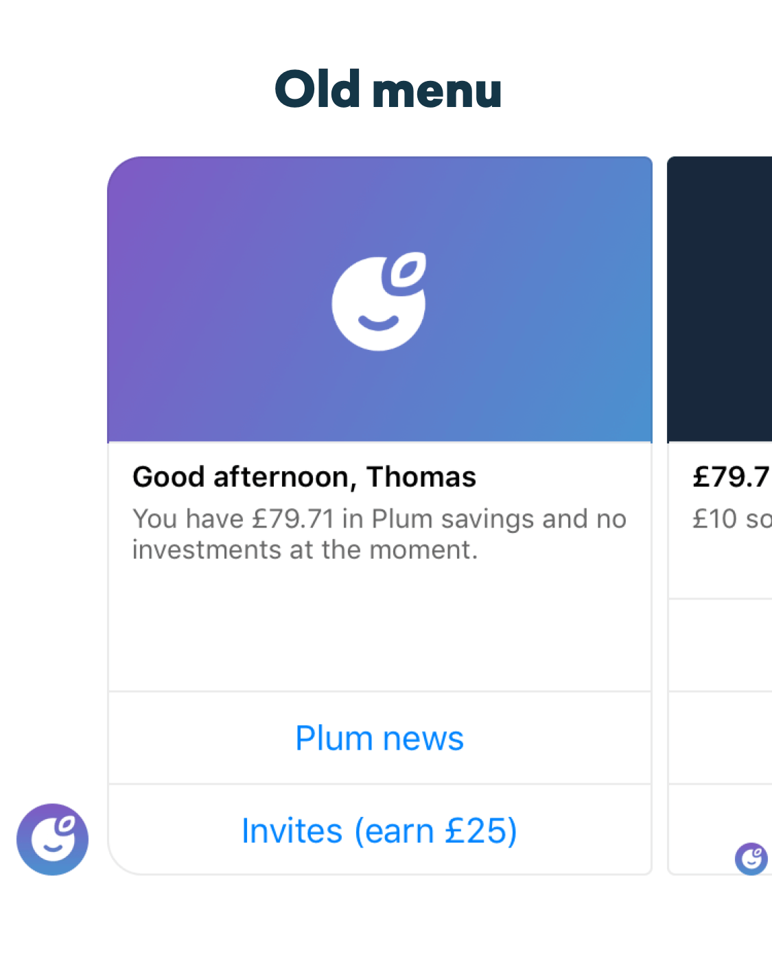
The old menu had a few limitations:
- It didn’t have a single place to get an overview of all aspects of Plum; your Savings, Investments and Insights. In order to view this information you had to scroll through the cards in the menu and look at them one by one. Not very practical.
- It included both things that you access often and things that you might only want to access once and then forget about – all in one place. We decided to clean things up and put the most important things in the foreground.
- Among other things, we’re releasing a new and improved investment feature VERY soon and the old menu could not cope with all of the information that we need to display.
The new menu
The process of designing the new menu involved making an audit of everything that was in the old menu, design the new information architecture, prototype the new menu, perform multiple rounds of usability testing. Finally, we launched the new menu to a small group of beta testers who opted in to test the menu in action.
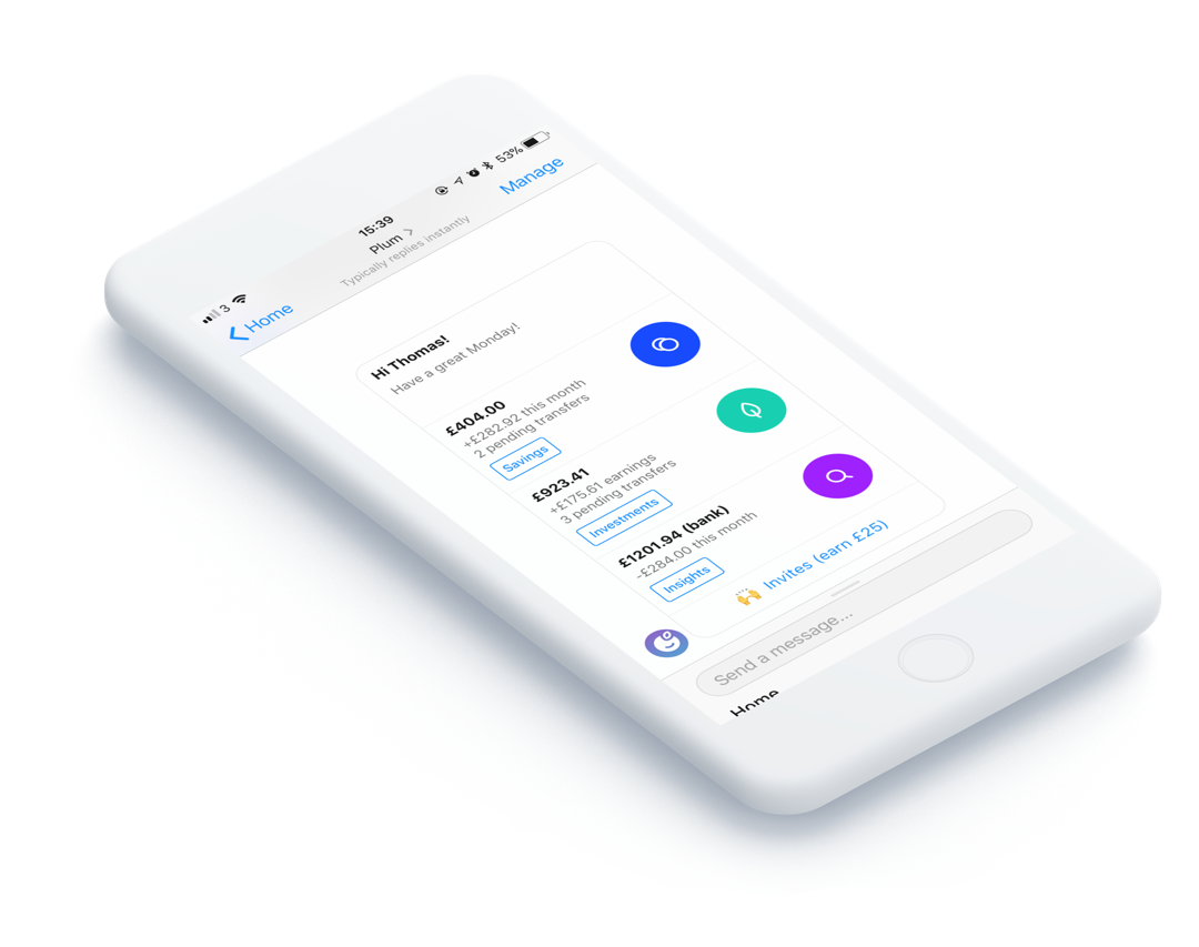
Throughout this process, we listened to feedback and optimised the details of the new menu. Users expressed that it would be useful to see pending transfers and performance of their investments on the new Home card, so we added it.
The end goal was to create a menu that is useful and easy to navigate.
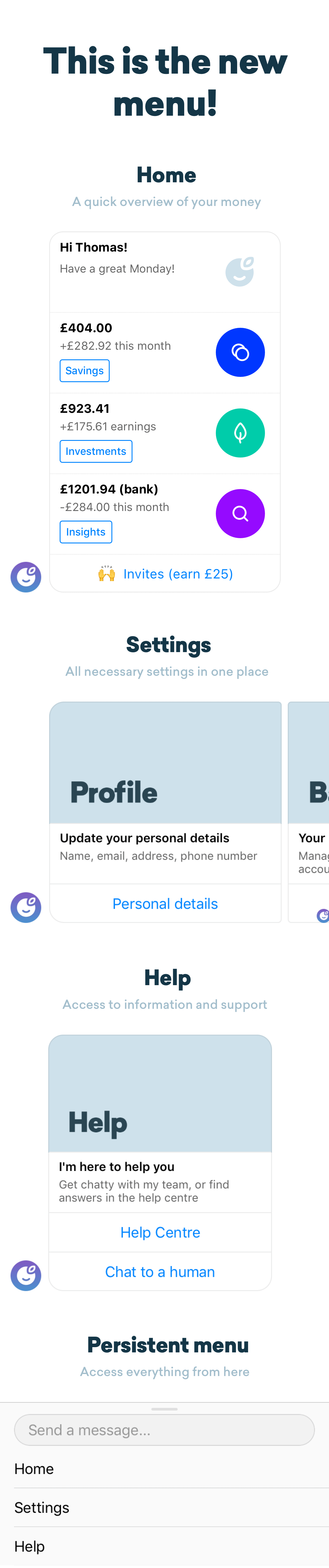
The new menu has three main sections; Home, Settings and Help.
Home is where you’ll spend most of the time. This is where you can see the most up to date information about your money and access your Savings, Investments and Insights options.
Settings and Help now have their own places in the menu so you can easily accessed them when you need them (but out of the way when you don’t).
What’s next
We really hope you enjoy the new menu but we’re always trying to improve the user experience for you guys.
If you have any feedback or suggestions on the menu please let us know by filling out this short survey. 😊
Plum makes managing your money effortless. Get started in just 5 minutes.